

“It’s been amazing working with GW+Co. The support and guidance they have given and what we have achieved with the brand refresh is unbelievable.”
Paul Crump, Global Brand & Marketing Manager
The challenge
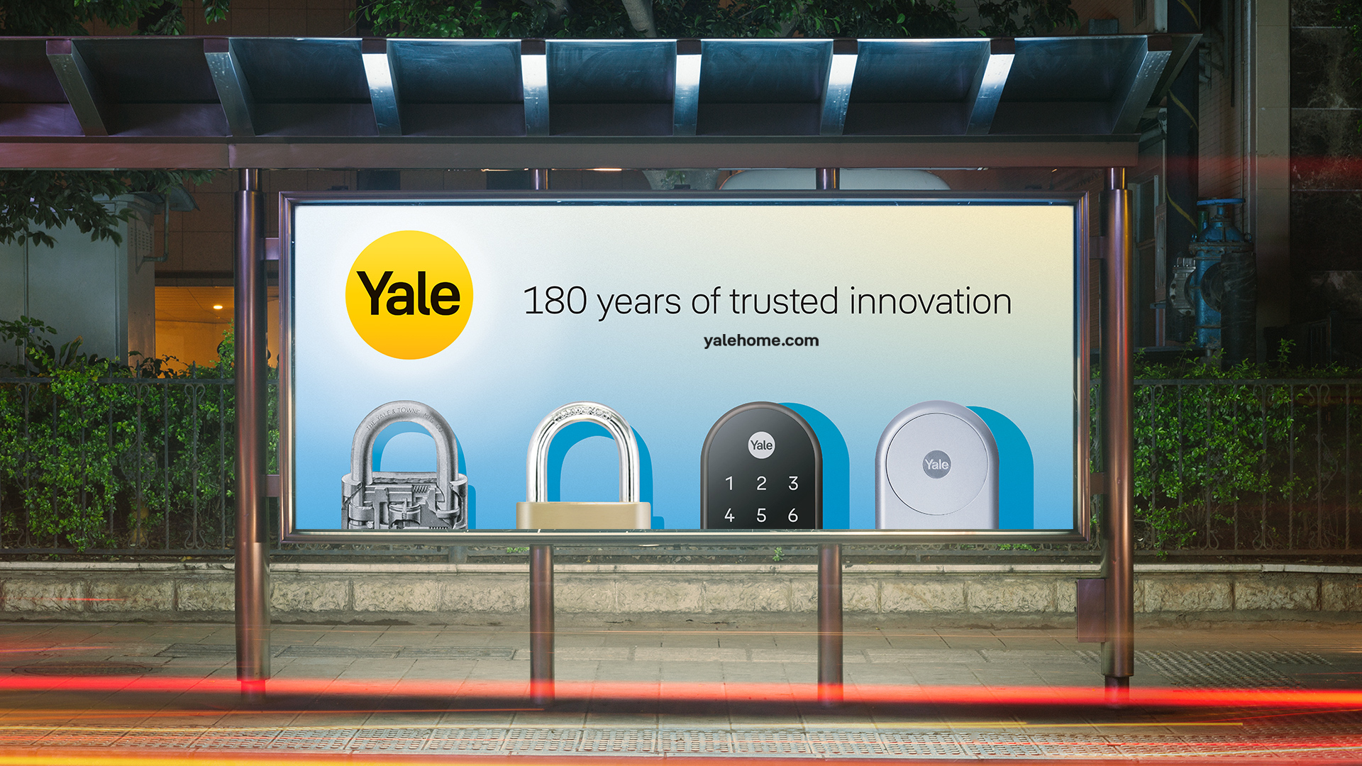
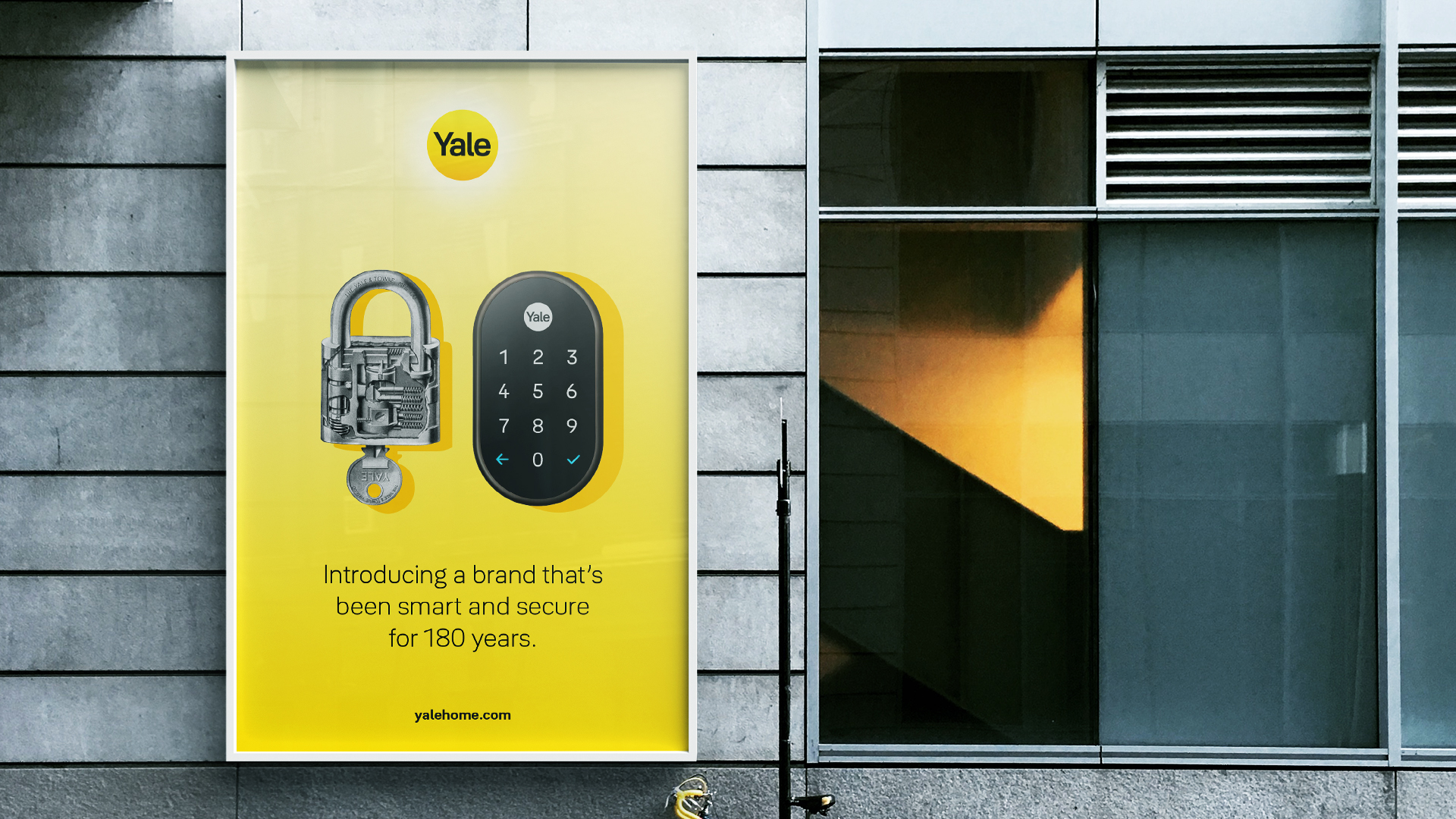
Yale is an iconic brand of lock makers with a 180 year history in innovation. With the emergence of the smart home, its industry is rapidly transforming. Competition has been intensified with new entrants from nimble start-ups to consumer electronics and data giants like Samsung, Amazon and Google.
Yale’s decentralised structure and largely autonomous regions meant there was little to no global brand consistency, in appearance or positioning. A deeper transformation was required, one that would include changes to culture and governance structures, as well as a strategic brand positioning for the global consumer market.
The goals
To transform Yale into a unified, future-focused global consumer brand for the digital age while leveraging its heritage.
To give Yale a consistent look and feel across the multiple regions, retail environment, online and internally.
To connect a disparate workforce, separated by geography, culture and language and build a global team of Yale brand advocates.
The strategy
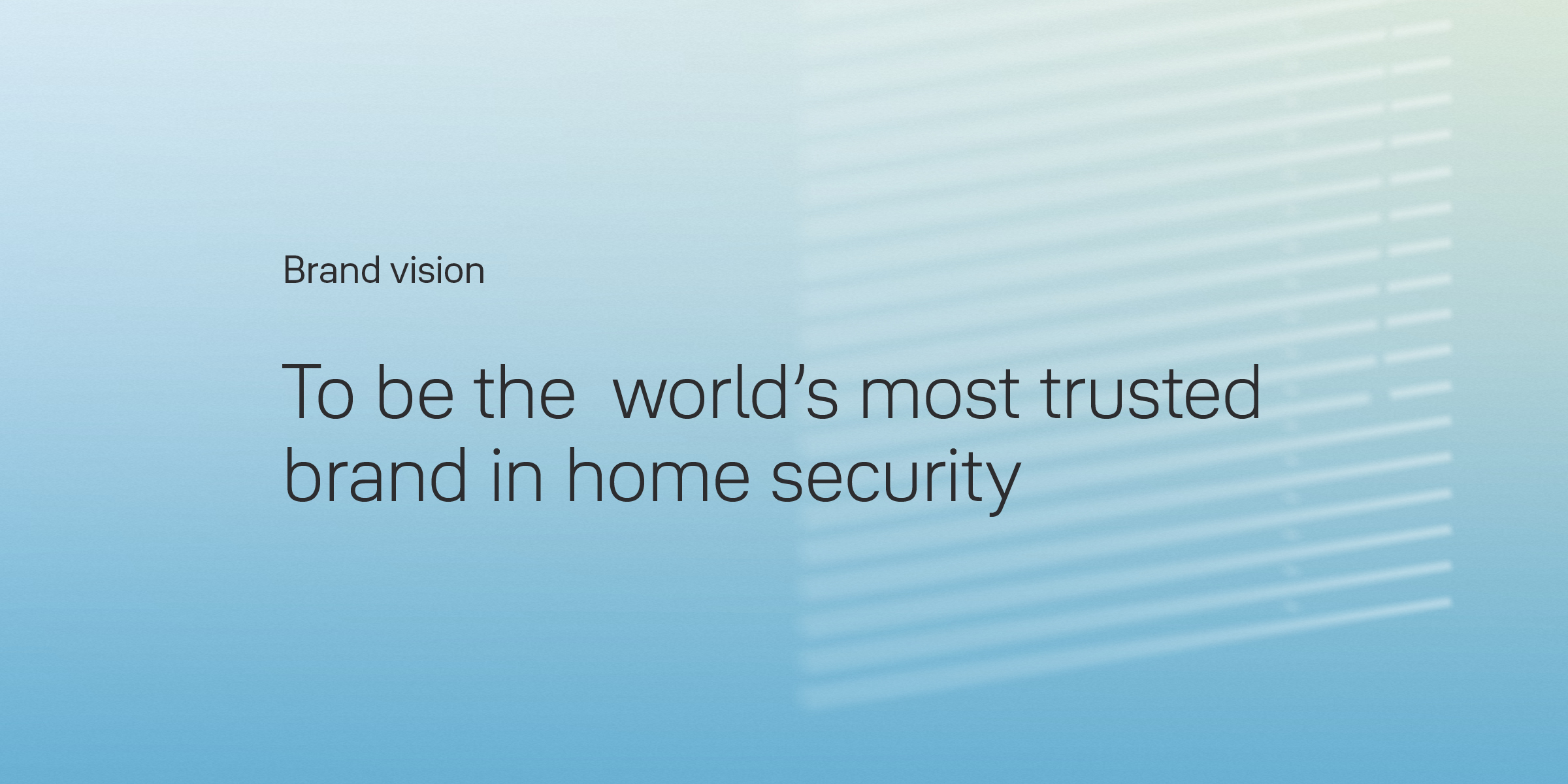
We worked both inside-out and outside-in, defining the brand purpose with the core team, and testing the value propositions with real customers in different regions. Using GW+Co’s Brand Compass framework, we created a visual representation of the brand strategy that impacts all elements of the Yale experience. At the heart of the Brand Compass lies the brand purpose: Yale exists to provide protection for the home and peace for the mind.
From this follows Yale’s brand vision: to become the world’s most trusted brand in home security, and four strategic priorities.
Six brand values were discovered: improving lives, putting customers first, innovating thoughtfully, creating seamless experiences, earning trust and setting standards. Behind each lies a story steeped in history and instrumental for Yale’s future.
The big idea
Yale is like the sun
Our design solution emerged from a simple idea: Yale is like the sun. It’s warm and positive. The sun is always shining (even when you can’t see it). And it sustains life – from morning to night.
‘Yale is like the sun’ is a universal metaphor that is understood around the globe. It informed every aspect of our design language: a palette of gradients inspired by sunlight, graphic shadows that images cast, a range of light-shape illustrations, photography with a presence of sunlight and a unique, positive tone of voice.
The rejuvenated brand
The branding
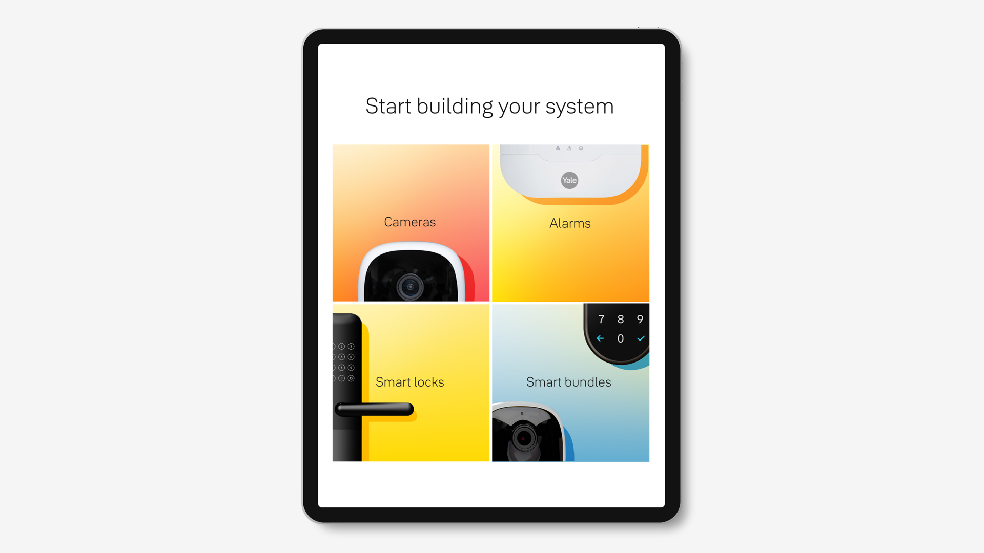
As creative consultants, we oversaw and directed all aspects of the brand experience and collaborated with both in-house and external partners on sonic identity, UX, motion and interaction principles, product design, packaging and film.
We created a straightforward design system based on several key principles. This ensures consistent implementation of the Yale brand across all touch points and by different local agencies. We then conceived a highly interactive, practical brand training workshop, in a format that regional leaders can re-create with their own marketing teams.
Logo refresh
Acknowledging Yale’s heritage yet looking to the future, we refreshed the logo for the digital age. The logo itself with the yellow circle was already iconic. So we carefully upgraded it, drawing inspiration from the sun, refining and opening up the letter shapes to make it work better at any size and application. Yale’s refreshed logo represents a perfect sphere of warmth, energy, trust and positivity.
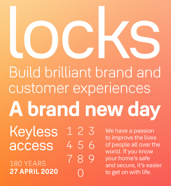
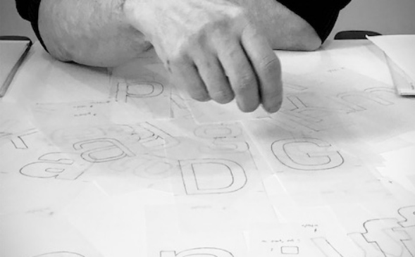
Yale Solis
We commissioned a unique new typeface, Yale Solis (designed by Jeremy Tankard) that is inspired by the central brand idea and connects this warmth with the visual aesthetics of Yale’s new product designs. Each letter is different enough from each other so that a computer can interpret it easily, but also aesthetically pleasing to the human eye. Particular emphasis has been placed on numbers as they feature prominently on products.
It has a softness to its appearance though not soft in its outline. The proportions create an even rhythm that elegantly and effortlessly conveys Yale’s voice.
The impact
A global organisation re-energised
Following the introduction to the new brand story and the training workshops we designed, the new system received universally positive feedback around the globe.
The new branding will be rolled out externally in the latter part of 2020.