‘I knew you would deliver’
ALEX BOTHA, CEO
Sector
Not-for-profit
Work undertaken
Brand Strategy
Positioning
Brand Identity
Illustration
Literature
Brand Guidelines
Project
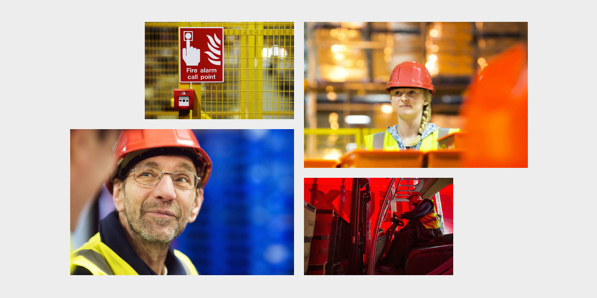
No-one likes accidents, everyone wants people to live. So how come health and safety gets such a bad rep? In part, it might be a misconception of what these organisations do. A sector that looks and talks in ways we don’t understand has to take some blame, too.
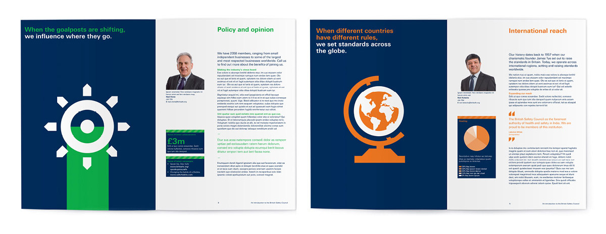
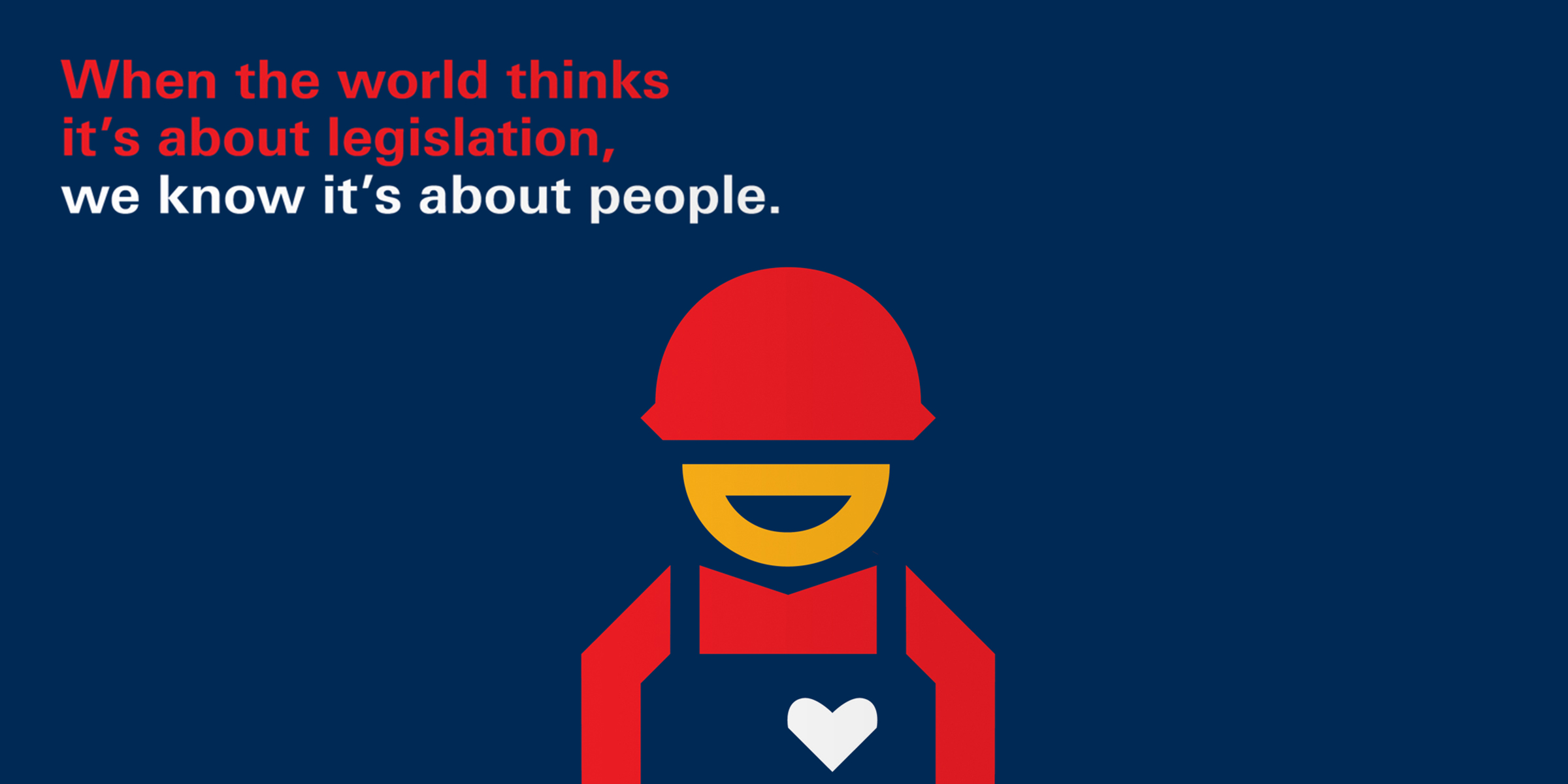
How could the British Safety Council, a respected international membership body, change that? We went back to the roots. Spelling out what health and safety are for, and doing so in a language that speaks to the heart.
Solution
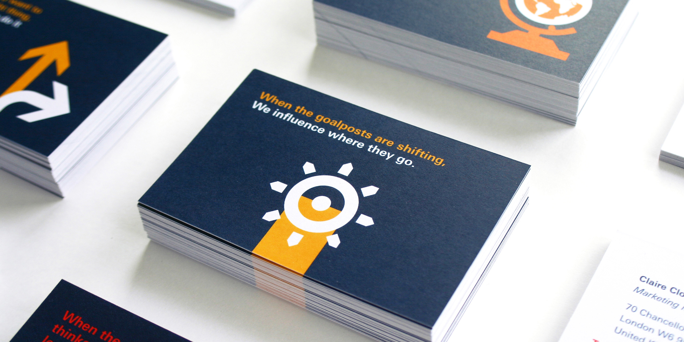
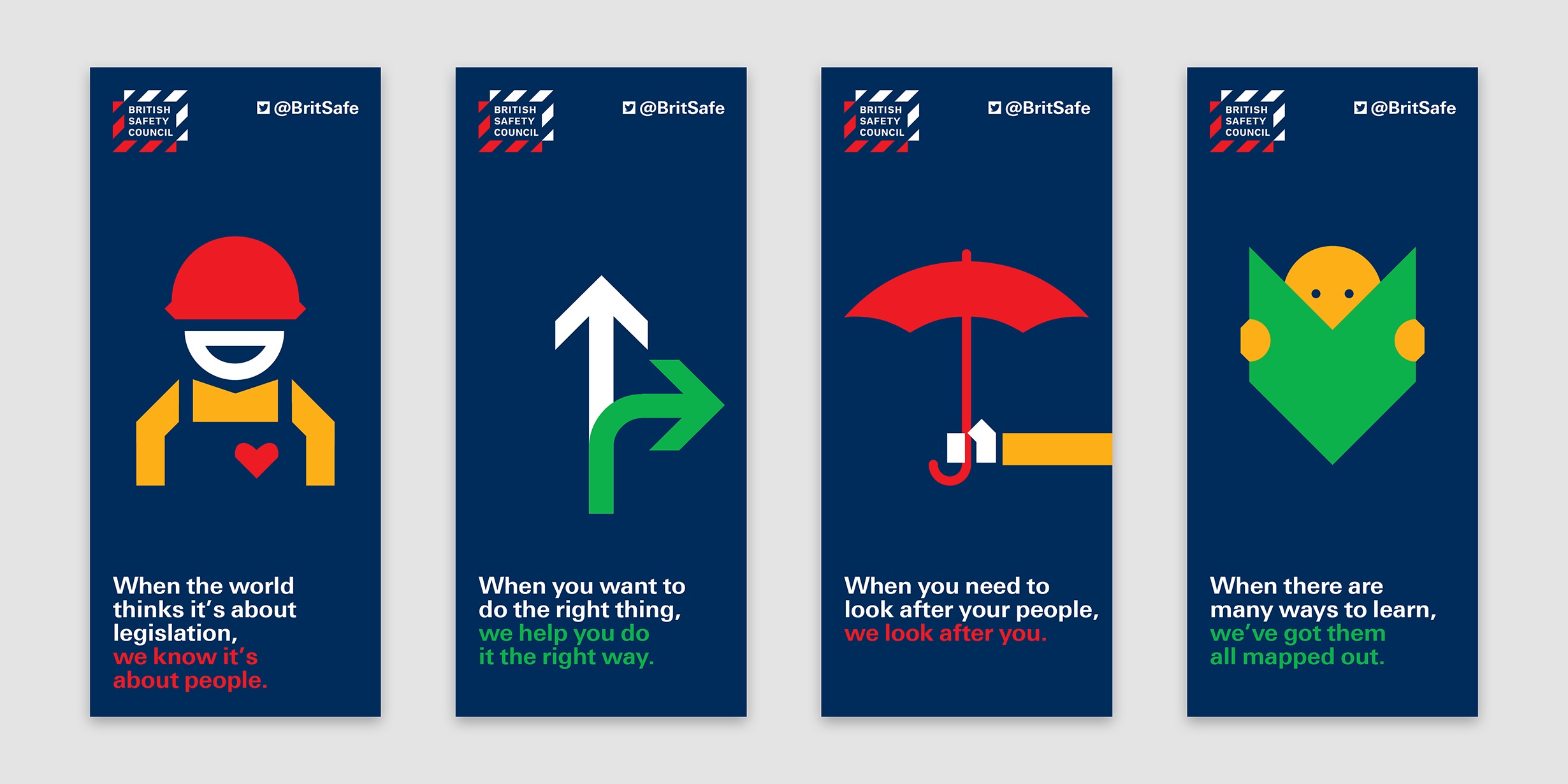
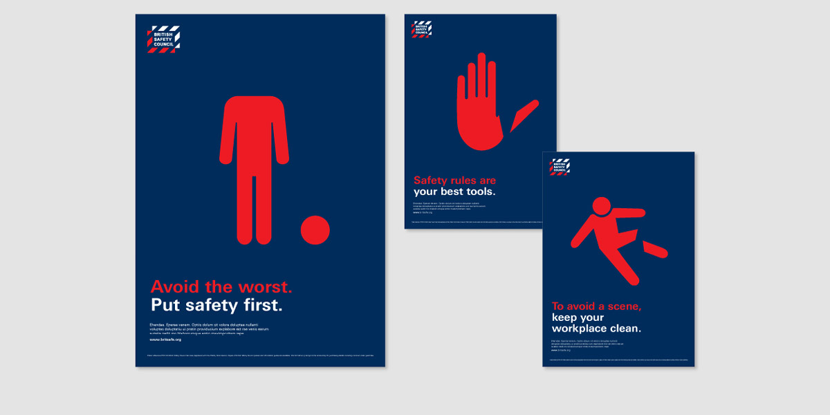
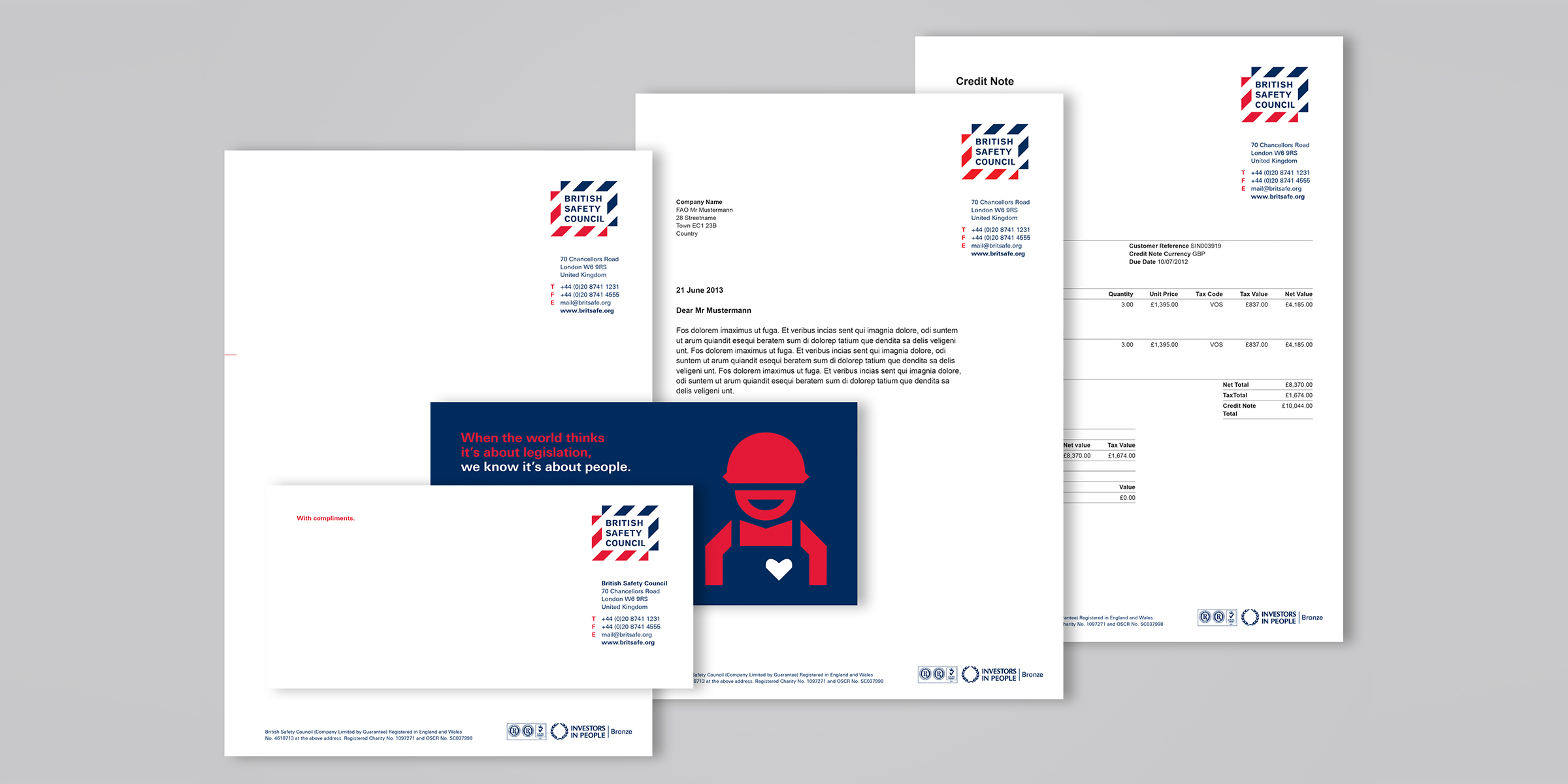
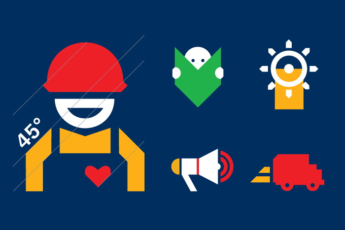
The visual design takes its inspiration from hazard stripes. It is simple, graphic and bold. Illustration are used to make specific points, the ‘spoken language’ tone of voice allowing for the occasional bit of wit.
Results
The new brand has invigorated the organisation (much needed after three CEOs in only five years). There is plenty to do, but a real change management program has been introduced to help make the vision come true, bit by bit.