They often remind me of a certain time. My first paid job was set in Frutiger, soon followed by Avenir. In college, I had passionate love affairs with Foundry Wilson and GST Polo, whilst Granby Elephant was the one that got away (it was never digitised so it stayed platonic). TheSans was a revelation, whilst Documenta is a hero of my days as a book designer, especially when combined with Antique Olive.
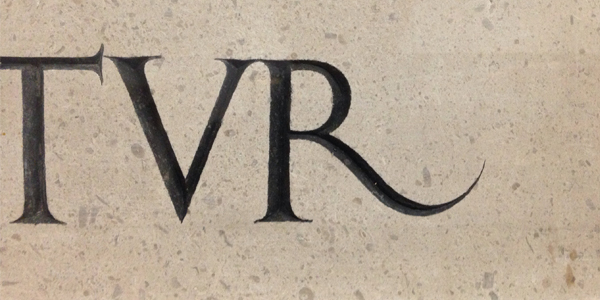
When choosing a typeface, I’m interested in their personality. Sometimes the personality of a single letter can inspire an idea. I was recently involved in the naming for a charity. It was founded by a gentleman who in his youth travelled the world to learn and widen his perspective. His charity now enables other young people to do so themselves. In discussing a name for that charity we arrived at The Traverse Trust. A little old fashioned perhaps, but very charming. It evokes anticipation, courage, and perhaps even a little apprehension. If you speak it out loud, you can almost hear the steps of a young hopeful person traversing the bridge to a new experience. Later that day, we visited an exhibition at Tate Britain. It was there that I spotted an inscription by Eric Gill. That inscription had an R which perfectly captured what I was looking for. It wants to walk. My involvement with the project is more strategic, but if I was to design a logo, I’d know where I’d start.
Gilmar Wendt is the Founder and Principal of GW+Co.
Contact him on gw@gilmarwendt.com @gilmarwendt


