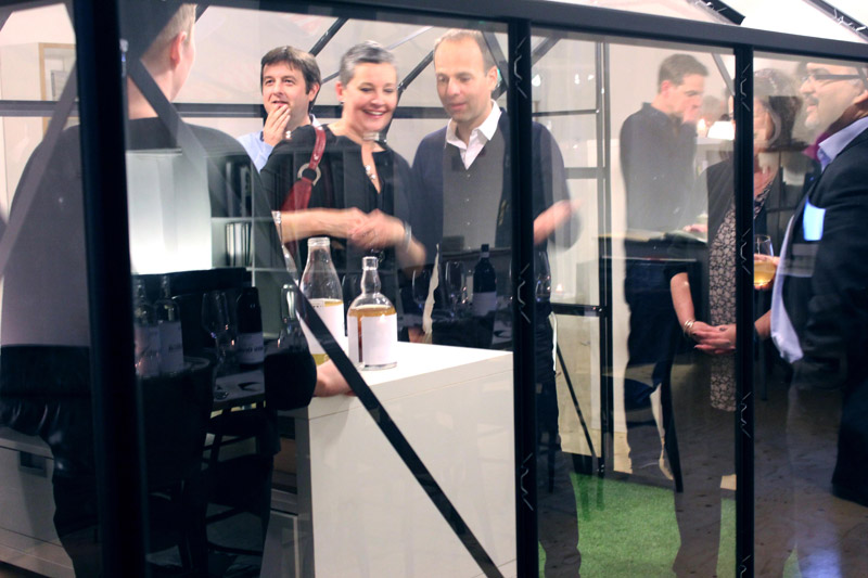
Since we rebranded our company and moved to an exciting space in the heart of Waterloo, we wanted to share this new stage in our story with our clients and friends. We decided to approach it in the same way we approach our work: everything had to be considered, everything had to have a reason.
As designers, we are fascinated about our work. Design is everywhere, from the fiver in your wallet to the tube map you’re reading to find an alternative route to the ‘signal failure’ on Piccadilly line. We love to explain design to people who don’t come from the field. Hence, we thought this could be a great opportunity to show our guests the elements we play with everyday: typography, form, proportion, and colour; and how the right combination of these elements can produce something extraordinarily useful and pretty.
But how could we connect that with food and drink? We needed someone able to illustrate these ideas on a plate. Blanch & Shock seemed to be the perfect candidates for this. Mike and Josh, the founders, have years of experience in elaborate bespoke catering and exploring different cooking processes. They were more than capable of understand a brief like this and suggesting new ideas. In the end we devised a menu linking food to design. Here is how we did it:
Typography
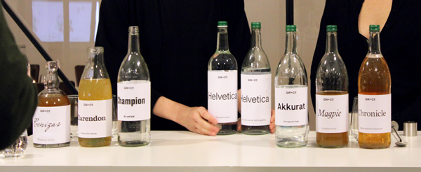
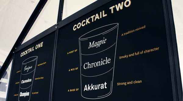
What is typography? How do we work with typefaces? Well, the first thing you explain to your friend is that there are mainly two groups of fonts: serif and sans serif. And combining them is one of the most interesting things about typography, but also one of the most difficult to master. Getting the right fonts that work well with each other is like making a good cocktail. Every font has a flavour and you can’t just mix them randomly without consideration. Blanch & Shock prepared two delicious welcoming cocktails, made of three different drinks each. Our challenge was translate the flavour of each drink into a typeface. As a result, vodka became strong, clean Akkurat and gin was dry, bold Champion. Sweet, sharp Clarendon was chosen for the role of apple juice, while characterful Chronicle played the pear. Magpie, a fairytale style font designed by Dalton Maag was the hint given by Lindesfarne mead. And the humble Cenizas font, chosen from the long list of fonts already installed on the system, was the handmade, twisted touch of sour Kombucha.
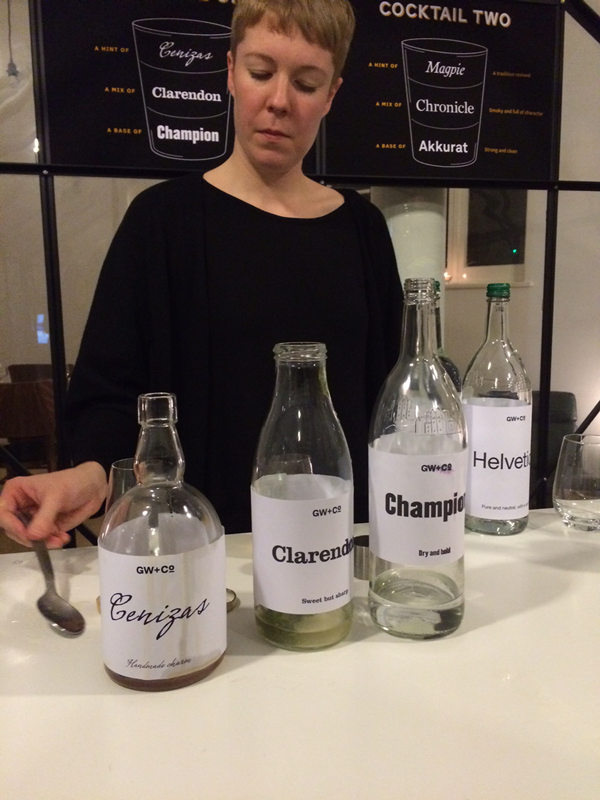
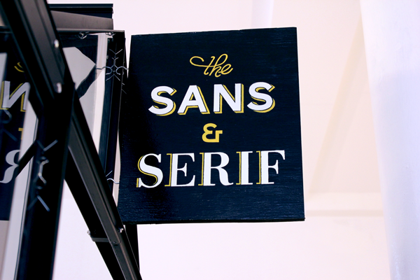
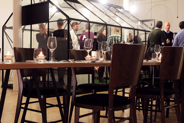
Our lovely meeting room (a glass house in the middle of the studio) was transformed into ‘The Sans and Serif’ pub, with its own hand-painted sign hanging outside. Our cutting table became the bar with a cocktail menu infographic
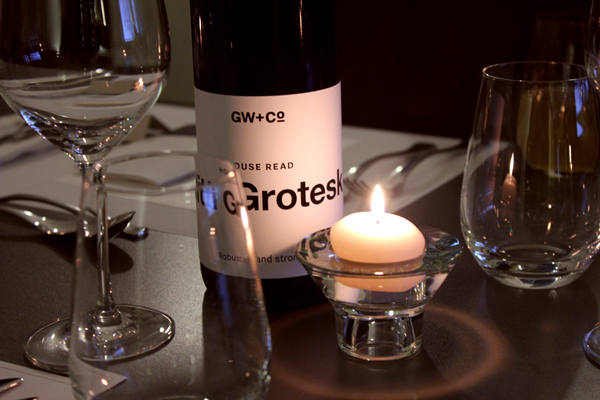
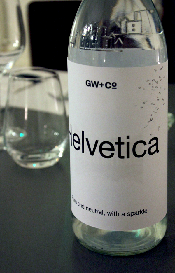
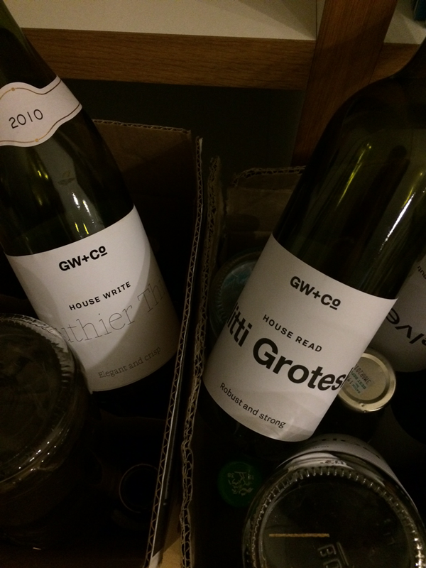
We still had to name our bottles of water and wine. What typeface is as neutral and pure as water? Helvetica. And which fonts could be our ‘House Read’ and ‘House Write’ wines? Our new brand typefaces: robust Nitti Grotesk and elegant Gauthier Thin respectively.
Form
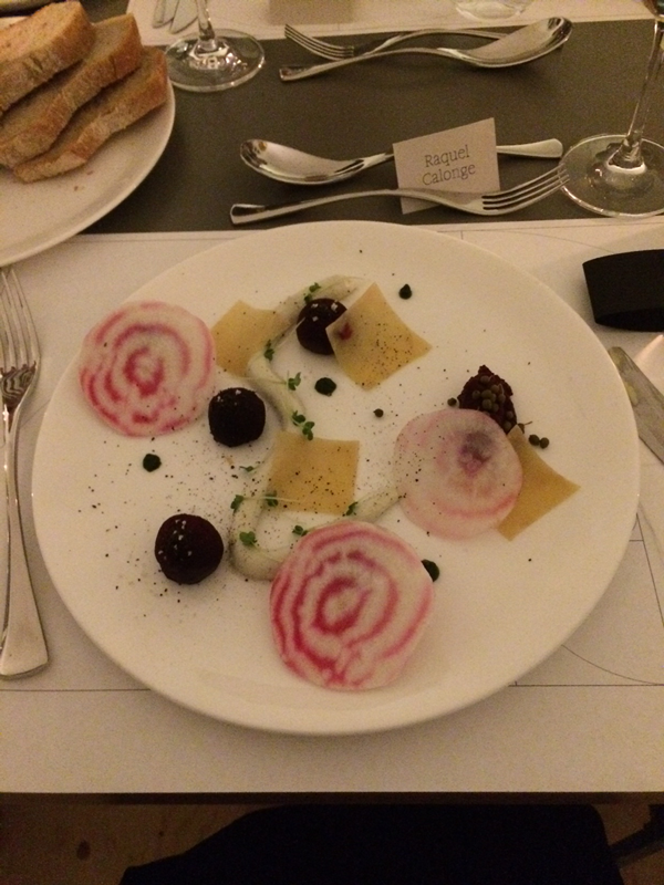
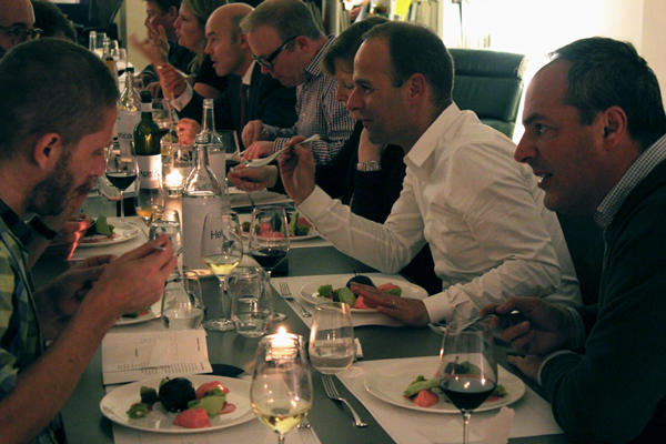
Everything can be reduced to simple forms such as dots, lines, circles and squares. Therefore you can create almost anything by joining these shapes together. Using Kandinsky as an inspiration, Blanch & Shock created a beautiful plate where the main ingredient was beetroot cooked in different ways and represented in different forms (as dots, squares and disks). But all these elements are useless without a canvas. We start every project with a blank page, so a blank sheet of rice paper was given to each diner at the beginning of the starters.
Proportion
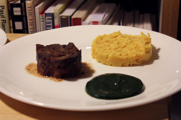
The Golden Ratio is present in everyday life, not only in objects but in nature. It has fascinated mathematicians, scientists and artists due to its perfection. Designers can use it to create the layout of a page, the size of a headline in comparison with the size of the body copy, etc. We decided to take that idea for the main course and do four perfect circles of fallow deer neck, swede baked in juniper wood, fermented mushroom ketchup and burnt kale sauce, each of them proportionally related by the golden ratio (more or less…).
Colour
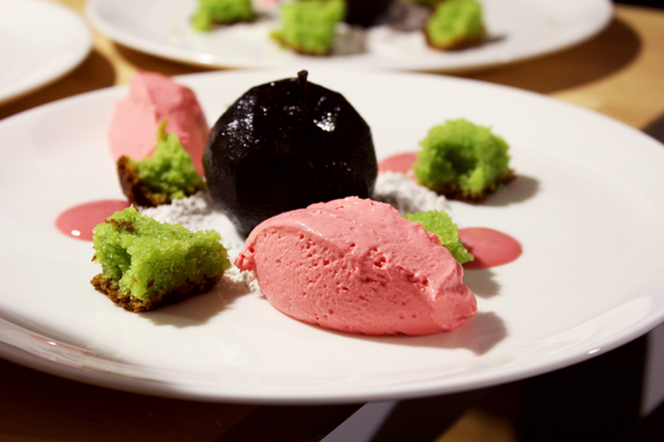
Colour seemed the right theme for the dessert. Despite thinking at first on doing something about CMYK and RGB, we thought why not going for the emotional part of colour. Colour influences our emotions, mood and feelings. Designers must of course know when and where use them in order to express the right thing. We wanted to confuse diners with a plate of food in different colours to those you expect. Mike and Josh served a poached black apple, surrounded by a suprising collection of green and red garnishes – the colours you expect an apple to be – as if the colours had bled out.
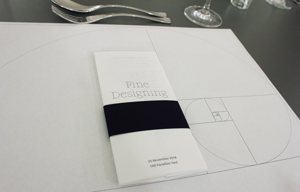
Now it was time for the final touch.We are print and paper lovers, so the menu should be a fine design piece too, a manual to explain what was going on and something that people could take home. By folding a piece of A3, we could divide the space in two parts, one for the theory (an introduction to the theme of the course) and another one for the actual food.
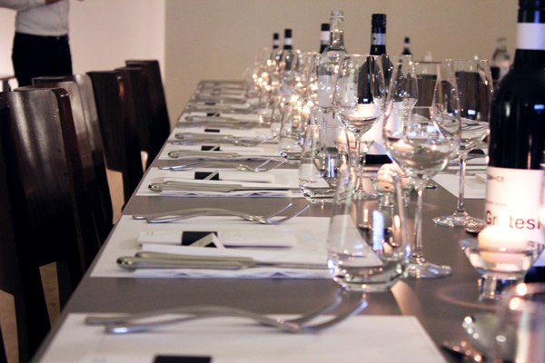
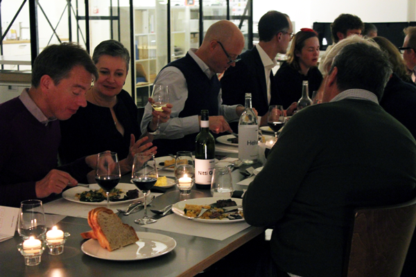
As we think our desks are very stylish, we didn’t cover them with a table cloth, instead we printed the Golden Ratio on an A3 sheets and used them as table mats. The place names were printed on a slightly grey paper placed within the table mat pattern. The tea candles gave warmth and coziness to the space.
After all this thinking and preparation, we were confident that we were going to host not only an enjoyable dinner, but a great experience, as we usually do with our work. And so it proved.
Raquel Calonge is a designer at GW+Co

