

A lot of water has flowed under the bridge since then, and publishing methods used nowadays go far beyond paper. Digital typography has replaced traditional metal and wood type, and the way we understand and work with typography has changed.
Technology is developing at the speed of light, and despite all the advantages, plugins and resources that we have, the quality of typographic detail that we find on the web is not quite at the same level as a printed book or magazine. It got me wondering… how can we achieve better typography online? The explosion of different device sizes has made it harder…
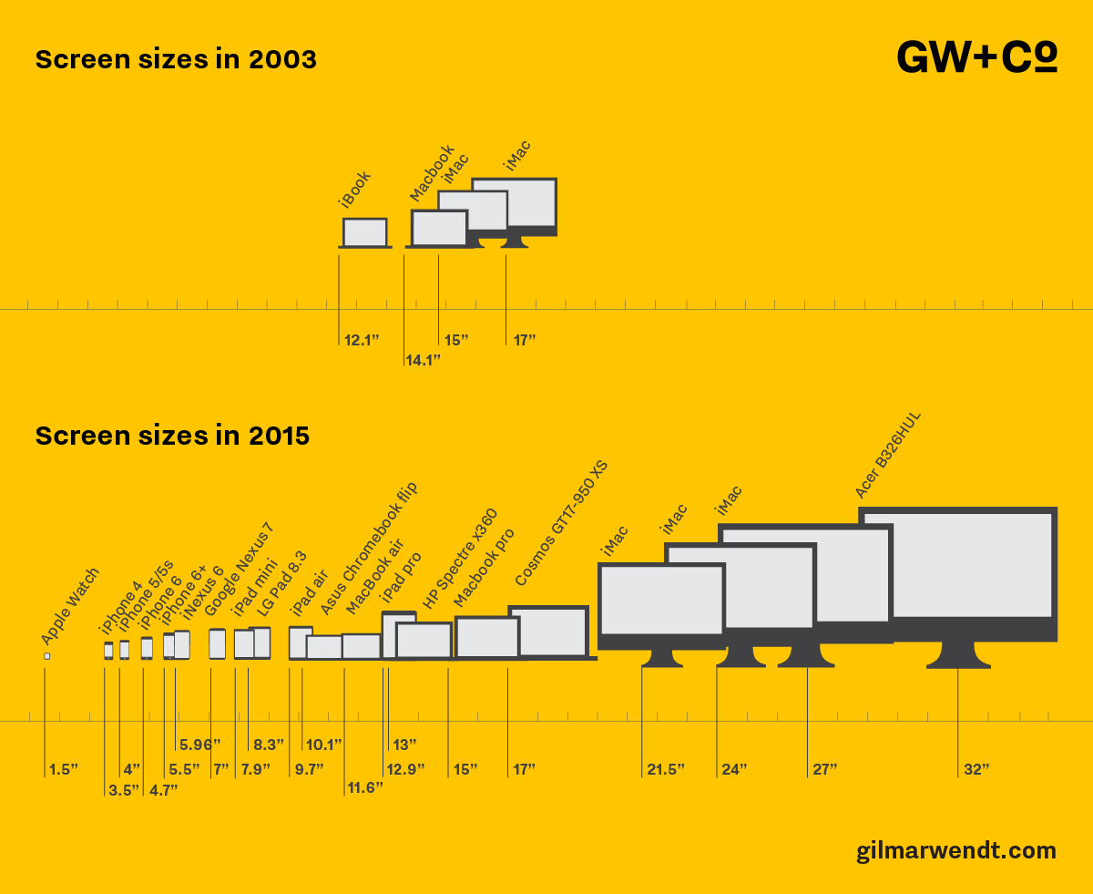
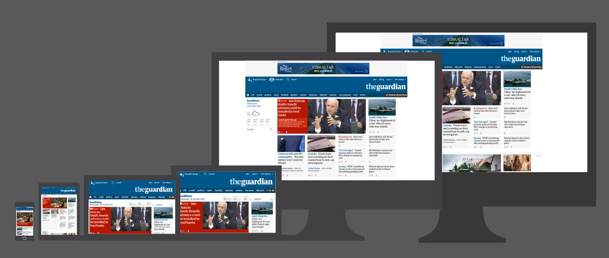
Today we have the choice of browsing websites while we are walking down the street or at home from a 27″ screen; and in both cases we have to be able to read comfortably the information displayed on them.
As designers, the main problem is that we can’t know the type of device, screen width and settings of every visitor. Also, web developers don’t necessarily have the background in typography that a book designer might have. Best practices from print are getting lost.
Here are two examples that I’m sure are irritating more than one typography geek – widows and optical sizing.
Firstly, there are a lot of widows online. In typography, a widow is a single word on the last line of a paragraph. They are thought to be poor typography as they are uncomfortable to the eye. In print design we can avoid them by adjusting the text manually. However, in web design, we are dealing with a variable page – the size of the screen or the browser window – which can vary as much as in the diagram showed above.
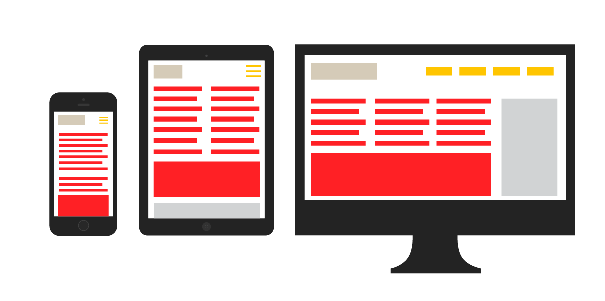
For each screen ratio, the text, as if it were water, adjusts to the screen width leaving us in a sea of uncertainty as to how it will be displayed. This flexibility makes it difficult to apply traditional typographic rules. Margins, leading and font size need to change depending on the screen size, so our understanding of the page layout has moved from a static grid to a flexible system where the content flows:
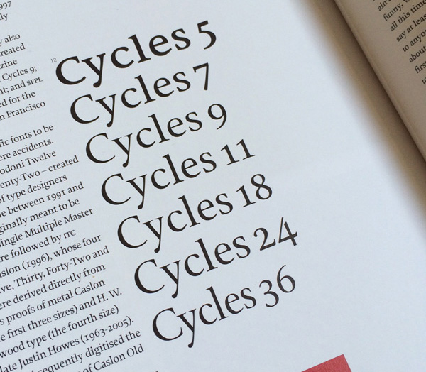
Here is a second example: a typeface designed for use in large headlines won’t work well as body copy. Traditionally, hot-metal type foundries created optically adjusted fonts to help readability for specific sizes. Some of these are now being digitised. In the picture below we can see how the Cycles typeface has been optimised for different sizes: spacing out the characters for small sizes and emphasizing contrast on bigger ones. Would it be viable to load seven versions of the same font in a responsive web world, where displaying content fast is a must?
But it is not only the wide range of screen sizes that affect typography, the diversity of browsers and operating systems also influences the way type looks. Each of them render type differently, sometimes making the characters look blurry, chubbier or broken. Today there are some plugins and CSS properties that help to improve this. Also, choosing a good font will help. Good type designers spend lot of time manually adjusting the characters of a font for better rendering on screen. This process is called hinting. Bruno Maag explains this very well in this video.
Although web typography has become better than it was, I want to question the current practices and explore whether it is possible and feasible to bring the typography quality that we find in print to the screen. There will follow more posts exploring this in more depth…
Subscribe to our blog if you don’t want to miss them!
Raquel Calonge is a designer at GW+Co