

I get the tube regularly, but not every day, so when I do I spend a lot of my travel time picking apart/staring dumbly at unfamiliar ads and posters.
Sitting on the Bakerloo line this week, I noticed just how much of the ‘offline’ advertising landscape is now dominated by websites or digital services – from Xero accountancy apps to (the suddenly omnipresent) Deliveroo takeaways to Relish broadband. All new companies offering shaken-up, user friendly versions of traditional services dominated until now by lumbering institutions. This shouldn’t be suprising, but I remember not long ago the tube was full of ads for hair-loss clinics and vitamin supplements.
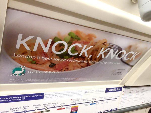
Although a lot of these services are welcome innovations, it doesn’t offer a very rewarding viewing experience. The great focus in the app/startup world on UX and seamless customer experience has led to the language used in the products and now the ads to be all about simple explanation in the fewest possible words. There’s often no real idea at all to the copy. The sophisticated art of the classic advertising copywriter seems to have vanished in place of a sort of Plain English Society monospeak. It’s almost like a return to a pre-Mad Men world when ads from the 50s just listed the product benefits.
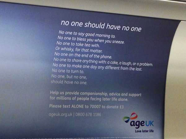
The one exception in this particular tube carriage was a charity ad for Age UK, a moving long-copy ad on the growing issue of loneliness among older people. The copy feels crafted, it takes the time to paint a picture and describe an experience rather than just bluntly stating facts and asking for a donation.
Of course it’s doing something very different, but I think it’s striking how, despite the tech world talking so much about content and experience in their products, the content and experience of their ads are so plain.
Joseph Harries is Design Director at GW+Co